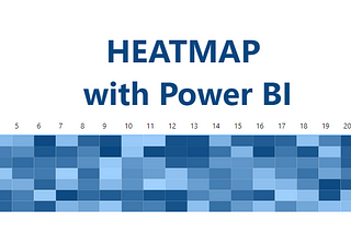
Ploii TubsamonCreate a simple heatmap with conditional formatting in Power BICreate a simple heatmap using matrix visualization.May 20, 20231May 20, 20231
Nilimesh Halder, PhDMastering the Art of Storytelling Dashboards: Top Tips and Best PracticesIn the world of data visualization, storytelling dashboards are a powerful tool for conveying complex information in an easily digestible…Mar 29, 2023Mar 29, 2023
InCodePintbyUmberto GrandoCreating a customizable Python Visual in Power BIHow to make a dynamic chart that you can change using a slicer!Feb 10, 2022Feb 10, 2022
InMicrosoft Power BIbyUmberto GrandoSupercharge Your Data Visualizations with SVGs in Power BILearn how to create engaging data visualizations with SVGsFeb 20, 2023Feb 20, 2023
David DingThe why and how of Standardising Power BI Report DesignDesign - is the art or process of deciding how something will look or work.Jan 17, 20221Jan 17, 20221
Nazhim KalamUnleashing the Power of Data: How Power BI Revolutionizes Data VisualizationPower BI is a powerful data visualization tool that has become increasingly popular in recent years. It allows users to analyze, visualize…Mar 11, 2023Mar 11, 2023
Kerem KargınWhy Do We Visualize Data?There is a lot of talk about data today, many things are being told. However, each data has a story that the data group actually hides…Feb 21, 20211Feb 21, 20211
Suli AhmedDo not create your dashboards with Power BI — Draw them first!Hey friends 👋 — In this article, we are going to learn to create dashboards from scratch! from where do we start? how to control layouts…Dec 16, 2022Dec 16, 2022
KrishniCustom Tooltips in Power BI — 5 Minute TutorialsThe default tooltips in Power BI display a very limited amount of information. However, Power BI has given us the ability to design custom…Feb 20, 20231Feb 20, 20231
Courtney WilliamsCreate Custom Power BI Theme via JSON FilesOn your report development journey in Power BI, you may have used the default report themes available. There is an array of predefined…Feb 21, 20231Feb 21, 20231
Aman SinghBest Visualization Practices to improve Reports in Power BIAbout the best visualization practices as an analyst to improve quality of reports.Jan 4, 2023Jan 4, 2023
InTDS ArchivebySalvatore CagliariHow to use Small multiples in Power BI to show multiple MeasuresIYou want to show various Measures with the same Axes? Here I show you how you can do this in one visualOct 17, 2022Oct 17, 2022
Amit ChandakField Parameters- Conditional FormattingProblem Description: While using Field Parameters, we want to do conditional formatting using the selected Axis of the selected measure…Oct 13, 2022Oct 13, 2022